Background
This article will show you how TailwindCSS can really increase our productivity and project maintainability by better organizing our code in certain scenarios.
Performance Effect
How TailwindCSS will affect our website’s performance?
This is a crucial question for most developers, but it is not the main topic that we will discuss in this article. For more information, check out Controlling File Size - Tailwind CSS official doc. The basic takeaway from this doc is that introducing TailwindCSS is very hard to end up with more than 10kb of compressed CSS.
The Design of CSS
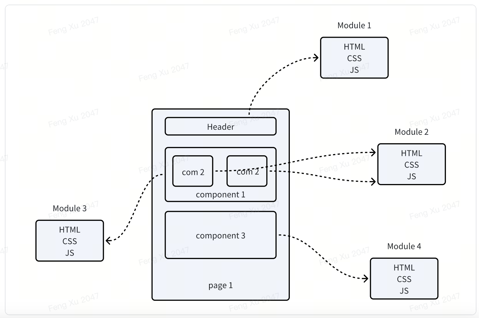
The design of CSS is affected by the design of HTML. CSS was born when HTML first came up, and was used for more than 20 years until now. As we know, before libraries/frameworks like React/Vue came up, websites were separated into HTML, CSS, and JavaScript. There isn’t modularity for website pages. Each website page is written in a single HTML/CSS/JavaScript file.
In order to provide a means of abstraction for reusing styles, CSS provides a class to help developers combine styles and reuse them in different places.
1 | // Without CSS Class feature |
React Brought Modularity and Makes CSS Class Redundant
React started using modularity concepts in websites, which treat websites as a combination of pages, and pages are a combination of components. Each component has its own HTML structure(JSX), style(CSS), and logic(JS) for reusing as a module.
The previous example in React is like:
1 | const HighlightP = ({ children }) => (<p class="highlight">{children}</p>) |
We soon find that the class that is provided by CSS is unnecessary because React already does modularity including style:
1 | const HighlightP = ({ children }) => (<p style={{ color: 'red', fontWeight: 'bold' }}>{children}</p>) |
By doing this, we reduce the map from CSS class to react component. This is the basic concept of TailwindCSS.
You might wonder what’s wrong with CSS class? We let compare them a bit more:
- Naming is hard. By writing CSS class, you must invent a name for each node that you wanna add style. This is wasting energy.
- Code for the same components is everywhere. If you write CSS class, you put component code in two places, the readability and maintainability reduced. E.g. When you delete the code, you might forget to delete the corresponding CSS class.
- Safe from Bugs. CSS is global and you might accidentally overwrite certain styles when you make changes.
Use TailwindCSS to Replace Inline Style
TailwindCSS provides better functionality than inline style:
- Designing with constraints. Using inline styles, every value is a magic number. With utilities, you’re choosing styles from a predefined design system, which makes it much easier to build visually consistent UIs.
1 | /** @type {import('tailwindcss').Config} */ |
- Responsive design. You can’t use media queries in inline styles, but you can use Tailwind’s responsive utilities to build fully responsive interfaces easily.
1
2
3
4
5
6
7
8
9
10
11
12
13
14
15
16
17<!-- Width of 16 by default, 32 on medium screens, and 48 on large screens -->
<img class="w-16 md:w-32 lg:w-48" src="...">
// CSS
@media (min-width: 640px) { ... }
5. Hover, focus, and other states. Inline styles can’t target states like hover or focus, but Tailwind’s [state variants](https://tailwindcss.com/docs/hover-focus-and-other-states) make it easy to style those states with utility classes.
<button class="bg-sky-500 hover:bg-sky-700 ...">
Save changes
</button>
// CSS
.btn-primary {
background-color: #0ea5e9;
}
.btn-primary:hover {
background-color: #0369a1;
}
A Brief Introduction to StyleX
Meta open-sourced a new CSS framework recently StyleX. It provides a different way of organizing CSS code than TailwindCSS.
I did some investigation and I’d like to share the fundamental ideas of StyleX here.
OOCSS(Object-Oriented CSS) Conventions
StyleX thinks that Utility Classes make HTML markup poor readability. So they still use traditional OOCSS as a way to organize code.
1 | import * as stylex from '@stylexjs/stylex'; |
While it managed to solve some issues of OOCSS Architecture by using CSS-in-JS, TypeScript, and Compiling:
- Modularity: Traditional OOCSS is global and it is poor in modularity. StyleX defines styles as a markup in component JS code to make it locally.
- Type-Safe CSS: By using TypeScript, StyleX is type-safe like other props of a component.
1 | type alignContent = |
- Avoid Bloated CSS(?): According to the official document, StyleX produces deterministic results not only when merging multiple selectors, but also when merging multiple shorthand and longhand properties. (e.g. margin vs margin-top).
But when I try locally, it doesn’t manage to merge anything.
1 | const s = stylex.create({ |
Conclusion
- Performance: As the class grows in the codebase, the performance will become lower, but if it is a small project, it is likely to outperform TailwindCSS since TailwindCSS will import unnecessary utility classes, and styleX only imports what we write in code.
- Maintainability & Readability: Utility classes(TailwindCSS) have their advantages but make the HTML markup ugly, styleX solves some issues of OOCSS but still leaves naming and class bloating unsolved.